Kodak Portra has become something of a legend in the film photography world, and for good reason. Here’s the story:
Origins and Evolution
Portra launched in 1998 as a replacement for Kodak’s Vericolor line of professional portrait films. The name itself is a portmanteau of “portrait” and “Kodak” — it was purpose-built for skin tones and professional portrait work.
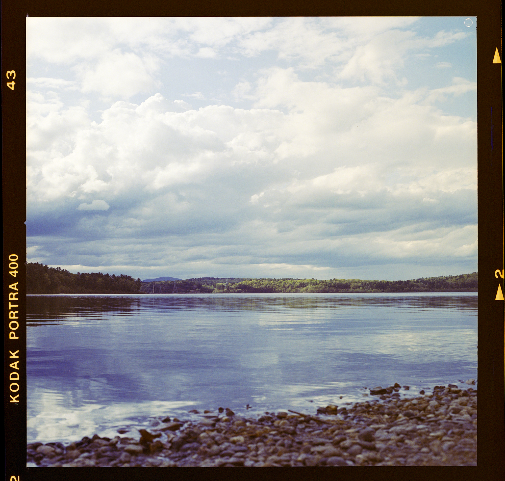
The line went through a major reformulation in 2010 when Kodak released the current “fourth generation” Portra stocks (160, 400, and 800). This version introduced finer grain, improved color accuracy, and better scanning characteristics — crucial as digital workflows became standard in professional labs.
What Sets Portra Apart
Skin tone rendering is Portra’s calling card. Kodak engineered the color science specifically to handle the subtle gradations of human skin across all tones, avoiding the magenta or green casts that plague many films.
Exceptional latitude makes it remarkably forgiving. You can overexpose Portra 400 by two or three stops and still get beautiful, usable images with creamy highlights rather than blown-out whites. Many photographers intentionally overexpose it for a softer, more pastel look.
Fine grain structure is surprisingly tight for its speed, especially in medium format where the larger negative really lets the film breathe.
Neutral color palette with slightly warm undertones gives images a natural, timeless quality without the heavy stylization of some consumer films.
Portra vs. Kodak Gold
These two films serve very different purposes. Portra is a professional stock with a neutral, natural color palette, while Gold targets consumers and delivers warmer, more saturated tones.
In terms of grain, Portra 400 is remarkably fine and tight for its speed, whereas Gold 200 has more visible, characterful grain that many shooters find appealing for its distinctly analog aesthetic.
The latitude difference is significant: Portra offers an exceptional five-plus stops of exposure flexibility, meaning you can overexpose substantially and still recover beautiful highlights. Gold is more moderate at two to three stops, requiring more careful metering.
For skin tones, Portra was engineered specifically for accuracy across all complexions, while Gold renders skin warmer and more stylized — lovely in its own way, but less true to life.
Contrast-wise, Portra is lower and softer, giving you more flexibility in post-processing, while Gold is punchier straight out of the scanner.
Price reflects the professional versus consumer distinction: expect to pay around $15–18 for a roll of Portra in 120 format, compared to $8–10 for Gold.
Gold has become trendy precisely because it looks unmistakably like film — that nostalgic, saturated quality many people associate with analog photography. Portra aims for transparency and flexibility; it’s a workhorse that doesn’t impose a heavy aesthetic on your images.
Ideal Shooting Scenarios for Portra
Portraits and weddings — This is its home turf. The skin tone accuracy and overexposure latitude make it nearly foolproof for people photography, especially in mixed or challenging lighting.
Golden hour and soft light — Portra really sings in warm, diffused light. Overexposed by a stop in late afternoon sun, it produces those dreamy, luminous images that have become synonymous with the “Portra look.”
Travel and documentary — The latitude means you can shoot from shadow to highlight without constantly metering, and the neutral palette adapts to diverse environments.
Fashion and editorial — Many fashion photographers still choose Portra for its combination of sharpness, color accuracy, and that subtle organic quality digital can’t quite replicate.
Where it’s less ideal: If you want punchy, saturated colors for landscapes or that gritty, contrasty street photography aesthetic, films like Ektar 100 or even Gold might serve you better. Portra’s restraint can read as flat if you’re after drama.
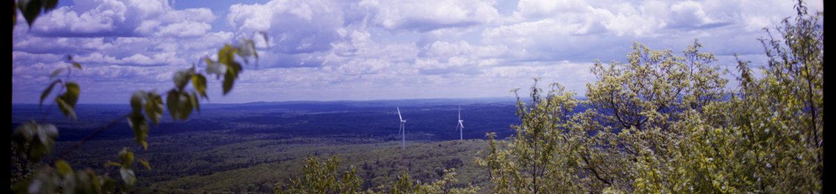
In medium format specifically, Portra becomes almost magical — the combination of the larger negative’s inherent depth and Portra’s fine grain creates images with a three-dimensional quality and tonal richness that’s hard to match. It’s the reason it remains the go-to professional color negative film even as other stocks have disappeared.
Purchasing gear from the above link helps me keep the site going!